
I find it rather odd that my degrees in Multimedia and Web Development/Design do not require me to take classes in Graphic Design. However, my degree in Multimedia requires me to take a few art classes (the Basic Design series and Intro to Drawing), and, my degree in Web Design/Development requires me to take Multimedia classes.
Here is the course description for Art 115 from PCC’s website: “Black and white design foundations studio experience centers on creative problem-solving, developing perceptual awareness and understanding and establishing critical skills and personal artistic vision.” This is a sample of the work I did in Spring 2009.

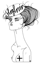
Gradient Portrait of Morchella
For this assignment we used black and white gouache to create ten degrees of shades with “1” being white and “10” being black. I took a photo of my daughter and processed it with filters in Photoshop to create an almost topographical map of the degrees of shading. I printed it out, used it as a reference point for drawing the outline out on bristol, and painted away. This was the first time I used gouache. I obviously need more practice, but the fumes from gouache make me nauseous.

Breast Is Best
In this assignment, we were supposed to create silhouettes with black and white Canson paper. I just went with wherever my X-acto knife took me and ended up with my kid about to latch on to my boob. I didn’t pre-draw this at all. Doing direct animation on 35mm film with an X-acto knife taught me that you only have one chance to get it right, so let go of your inhibitions and just go for it. What I like about doing paper cut outs is that it not only forces you be be more precise, it makes you pay attention to negative space.

I Know My Chicken
In this assignment we took one sheet of sheet of either black or white Canson paper and a half sheet of its opposite color. We were to take the half sheet and cut it up so that it seemed to take up more than just a half of the space. I got this on the third try. I tried to do a morel, then my dog. My boyfriend had just bought a chicken book. It had been laying on my floor for a few days, staring at me. So, I decided to pay homage to its cover model.

Winston Churchill
In this assignment, we went through stacks of magazines and picked out black and white photos to enlarge using the grid system. I was going to do a cemetery, but it the trees and the grass proved to be way beyond my capacity at the time, so I settled on Winston Churchill. This is probably the first “realistic” drawing I have ever done. Prior to this, I mainly made cartoons of people I hate. Anyway, think I did alright, but notice how the outline of his nose and wrinkles don’t blend in too well, therefore, making him look somewhat cartoonish.
In the next post, I will be featuring work from Intro to Drawing. Enjoy your weekend!
Cheers,
![]()


I love the drawing of Winston Churchill — I’ve always been into art, but have never been able to draw anything freehand besides your basic landscapes. I really like the different shades of pencil you used and his left (our right) eye.